Tab Bar
The Tab Bar at the bottom of the screen allows you to quickly switch between the Activities, Tasks, Graphs, and Info views.
Activities Tab
Main Screen
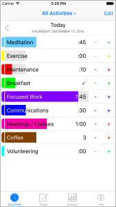
 In the Activities tab, the main screen shows the activities you are tracking. The first row allows you to choose the date. Below that is a row for each activity. The + and – buttons on the right side are a way to quickly add or remove an entry for the activity. Touching the row takes you to the detail screen for the activity.
Tapping “Edit” on the Main Screen allows you to re-order or delete activities. No particular order is required; just sort them however works best for you. Tapping “Done” exits editing mode.
You can filter which activities you want to look at by pressing the title control.
Activity Screen
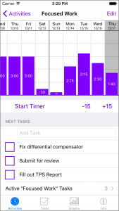
 Each activity has its own detail screen, which you get to by selecting the activity on the main screen. Here, the graph will show only entries for the selected activity. If the measurement type is minutes, a button under the graph allows you to start the activity timer. You can also manually add or remove items for the selected day on the graph.
For activities with tasks, the first three tasks in the list are displayed on the Activity Screen. You can view any more by selecting “Active Tasks”. The “Completed Today” section shows all tasks you’ve completed today for the activity, and similarly, you can see more by selecting “All Completed Tasks”. You can quickly add a task by tapping in the “Add Task” text field, typing a title for the task, and tapping “Done” on the keyboard. To complete a task, tap the task’s checkbox. To delete a task, swipe the task to the left and tap “Delete”.
The “Edit” button on the Activity screen is used for reordering tasks; for activities without the task list, the button will be disabled.
Scroll down on the Activity screen to see the settings for the Activity, which you can change.
From the Activity screen, touch “< Activities” in the upper left corner to return to the main screen. Returning to the main screen will pause the activity timer if you have started it.
Graphs Tab
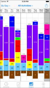
 The Graphs tab graphs your activity time by Day, Week, or Month. (‘By Year’ is coming in a future update.) Labels indicate the total time in hours and minutes. For items that are measured by count, 1 count is defined to be equivalent to 15 minutes, for the purposes of the graph.
In ‘By Day’ mode, you can select a day by touching a column. The selected day is also reflected on the ‘Activity’ tab.
The vertical scale of the graph adjusts as you scroll horizontally, so that each graph column fits within the vertical extent of the view.
The horizontal grid lines always represent approximately 30 minutes per day. For the ‘By Day’ graph, the lines represent 30 minutes exactly. For the ‘By Week’ graph, the lines represent 30 minutes times 7 days, or 3.5 hours. For the ‘By Month’ graph, the lines are at 30 minutes times 30 days, or 15 hours. (Technically, the ‘By Month’ lines should perhaps be at 30 minutes times 365 days divided by 12 months, which is about 15.2 hours… but the author likes the even 15 hour marks better. For the coming ‘By Year’ graph, the lines are at 365 times 30 minutes, or 182.5 hours, about 7.6 days.)
Notification Sounds
Daypractice uses “alert sounds,” so that you can hear the notifications over background audio playing on your device. That means they respond to the mute switch, and to the “Ringer and Alerts” volume setting, like other alerts.
To hear the sounds, make sure the mute switch on your device is off. In the Settings app, select “Sounds” and adjust the “Ringer and Alerts” volume. If “Vibrate on Ring” is turned on, your device will also vibrate when Daypractice alerts sound, which may or may not be what you want.